Cards
Bootstrap’s cards provide a flexible and extensible content container with multiple variants and options. Please read the official Bootstrap documentation for a full list of options.
Card title
Lorem ipsum dolor sit amet, consectetur adipisicing elit. Facilis non dolore est fuga nobis ipsum illum eligendi nemo iure repellat, soluta, optio minus ut reiciendis voluptates enim impedit veritatis officiis.
Go somewhereCard header Dashkit only
Easily create a card header of a fixed height and populate it with text, buttons, or a navigation.
Card title
Lorem ipsum dolor sit amet, consectetur adipisicing elit. Perspiciatis fugiat dolorem, expedita rem. Quis natus officiis asperiores rem ipsum, dolore cumque voluptatum iste vel alias, recusandae culpa hic pariatur quos.
Card header navigation Dashkit only
Use the default Bootstrap grid and the .nav component to easily add a perfectly aligned navigation inside a card header.
Card title
Lorem ipsum dolor sit amet, consectetur adipisicing elit. Officiis tempora architecto, sit a repellat dignissimos consequatur mollitia qui consequuntur recusandae numquam voluptate maiores, non cumque illo laboriosam sint dolores. Nostrum.
Inactive Dashkit only
Merge your card into a background with the .card-inactive modifier.
Fill Dashkit only
Make a card fill the whole available space to fit the height of a neighboring card with a .card-fill modifier.
Traffic Channels
Weekly Sales
$24,500 +3.5%Orders Placed
763.5Conversion Rate
Avg. Order VaLue
$85.50Adjust Dashkit only
Make a card vertically shrink (with a scrollbar) to match the height of its neighboring card with a .card-adjust modifier.
Recent Activity
View allLaunchday 1.4.0 update email sent
Sent to all 1,851 subscribers over a 24 hour period
2m agoLaunchday 1.4.0 update email sent
Sent to all 1,851 subscribers over a 24 hour period
2m agoLaunchday 1.4.0 update email sent
Sent to all 1,851 subscribers over a 24 hour period
2m agoLaunchday 1.4.0 update email sent
Sent to all 1,851 subscribers over a 24 hour period
2m agoPopular Content
Export| Page Title | Pageviews | Pageview % | Time/Page | |
|---|---|---|---|---|
| Homepage | 97,028 | 35.5% | 2:14 | |
| Blog | 7,283 | 9.7% | 1:53 | |
| My Account | 5,782 | 6.7% | 2:03 | |
| Why Dashkit? | 5,012 | 5.9% | 0:45 | |
| Documentation | 2,230 | 2.4% | 6:10 | |
Profile Dashkit only
Combine the default Bootstrap and Dashkit components to create beautiful large and small profile cards.

Team Dashkit only
A similar to profile cards team component compiled of the default Bootstrap and Dashkit components.
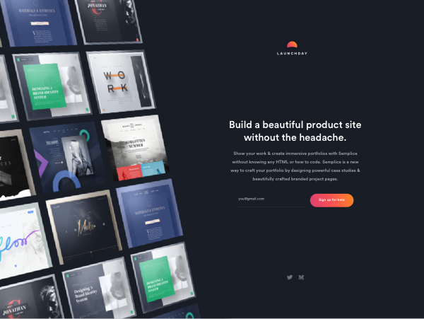
Launchday
Launchday is a SaaS website builder with a focus on quality, easy to build product sites.
Updated 2hr ago
Project Dashkit only
Another combination of the default Bootstrap and Dashkit components that scales perfectly to look good on screens of any size.
Files Dashkit only
A .card component variation perfect to create a list of files available for download.
Statcards Dashkit only
Create beautiful statcards with the default .card component and the combination of the Bootstrap components and icons.
Budget
$24,500 +3.5%Posts Dashkit only
A combination of the .card component, illustrations and margin utilities.

We released 2008 new versions of our theme to make the world a better place.
This is a true story and totally not made up. This is going to be better in the long run but for now this is the way it is.
Try it for freePricing Dashkit only
A .card component variation for a pricing option.
Basic plan
- Unlimited activity
- Direct messaging
- Members 10 members
- Admins No access
Kanban Dashkit only
A .card component variation for a kanban item.
Create the release notes for the new pages so customers are warned.
Jun 9
Create the release notes for the new pages so customers are warned.